Your logo is the cornerstone of your brand. It communicates who you are. People remember your logo, and associate it with your brand. That’s why it’s worth taking time to develop the right logo.
Think of the following global brands: Apple, Google, Harley Davidson, Adidas… What comes to mind? Yes, you’ve got it. A clear, identifiable logo.
But how do you choose the right logo for your company? There are several different styles you can choose from. Some logo design styles lend themselves to certain brands better than others and there are factors that will determine which style is best for your brand.
Here's a breakdown of the different logo styles, and which businesses they are most suited to.
Lettermark (Initials) Logo
Some business names are long: National Aeronautics and Space Administration, for instance. Do you recognise that name?
NASA is more identifiable and memorable than National Aeronautics and Space Administration, right?
Longer names are harder to remember, and don’t lend themselves very well to simple, iconic logos. Communicate your longer brand name efficiently and directly with initials.
When a logo uses only initials, and nothing else, we call this a Lettermark. VISA is a good example of an effective and identifiable Lettermark. When creating a Lettermark, the designer plays with typography to create an iconic logo from your brand’s initials.
When to use a Lettermark:
Good to use for longer business names or when a business refers to themselves by it's abbreviations. Lettermarks are direct and simple. They are easily adapted for websites and other branding material.
Wordmark Logo
A Wordmark is similar to a Lettermark. A Wordmark uses the brand name as the memorable mark. Think Google, Coca-Cola or Pinterest. The typography has been specifically designed to suit the brand. Whenever the logo is presented, the business name is read, therefore building brand recognition quickly and strongly.
37% of the top 100 brands in the world use a Wordmark. And there is a reason for this. A Wordmark directly communicates who you are, as well as creating an iconic brand image.
When to use a Wordmark:
Good to use when the name is reasonably short. Wordmarks are a great way to build brand recognition. This style won’t work if the business name is long. Consider using a Lettermark or Combination style for longer brand names.
Illustrative Logo
Characters and mascots are used to create an emotional connection between the brand and the buyer. An illustration sets the scene and provides more detail than other styles, like the Lettermark or the Wordmark. Let’s look at the KFC example. We all know KFC, and we recognise The Colonel. He is the face of KFC and has been right from the start. The face of the Colonel is inseparable from the brand, and invokes a sense of warmth and familiarity.
In an Illustrative logo, both text and image can be used together, or separately.
When to use an Illustrative Logo:
If a mascot is an important part of branding. To help elicit an emotional connection to the brand. Ideal for family brands. Illustrative Style Logos can take longer to create than other styles.
Combination Icon & Text
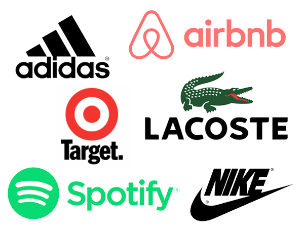
56% of the top brands use a combination of text and icon. Adidas is a great example of this. The Combination is commonly used because it is versatile, simple and direct. It’s also very responsive. The Combination directly communicates the name of the brand, and creates an iconic emblem for the brand.
These logos tend to take longer to create, as you are developing both text and icon. A Combination logo is great when developing a phone app for your brand, because the icon can be used as a separate element to the font and still be recognisable.
When to use a Combination of icon and text:
This style is great for new and not yet established businesses to communicate name of brand, as well as create memorable icon. Simple and direct. Responsive. Great for phone apps.
Badge & Emblem Logo
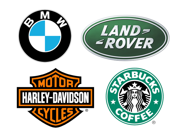
The Badge or Emblem logo is commonly used for schools, car companies, and in the food and beverage industry. Great examples are Starbucks, Harley Davidson and Guinness. The Badge has a traditional, classic feeling. It also provides a sense of authority and stability, which is why it works well for governments and official businesses. The Badge tends to include the text and a graphic element inside a shape, like a shield or circle. It may be less versatile than other logo styles because the logo must be of a decent size to be able to read the text.
When to use a Badge Logo:
Use for official businesses, or brands that evoke a traditional, classic feeling. Because Badge or Emblem logos include the text within it's shape, it can make them less responsive and may need to be adapted for use as a phone app for example.
Responsive
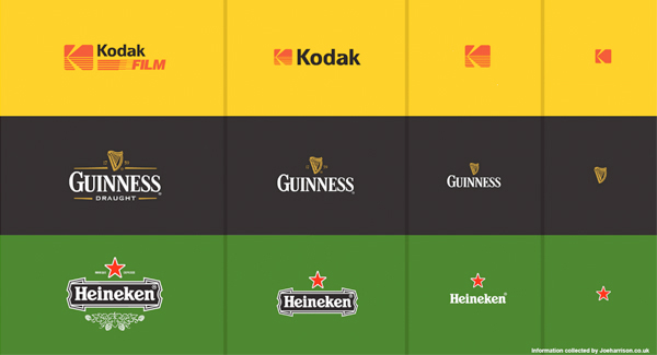
Responsive logos are logos that can be adapted for different platforms and purposes. Responsiveness is becoming more and more important as businesses tend to have a presence on more than one platform. You may need to use your logo on a giant billboard, as well as a phone app. Responsive logos allow you to do this. The Responsive logo will change depending on where it is being used. It is fairly easy converting a Combination logo into a Responsive logo because the text and icon elements are easily separated, without losing brand recognition. A Badge logo will have to be simplified considerably in order for it to be responsive, as would an Illustrative or Wordmark logo.
When to use a Responsive logo:
Use when the logo has a range of uses. Read More about Responsive logos.

Take time to consider which logo style will work well for your brand. Talk to us about developing a memorable and iconic logo for you, which communicates your brand and suits all your needs.


